StoryGraph — matplotlib storytelling toolkit
open sourcematplotlib can draw anything — and its defaults show data without telling stories: rainbow colors, framed legends, rotated labels, and a title that names the axes instead of the finding. The reader has to do all the thinking.
The problem
After reading Cole Knaflic's Storytelling with Data, I wanted to apply its principles in the library I actually work in — fast and repeatably. But default matplotlib fights that at every step: each chart is a from-scratch battle against clutter, and nothing carries over to the next one.
Why it mattered
In analyst work a chart that only shows data is a finding nobody acts on — the point is buried under rainbow bars and a framed legend, and the reader moves on in two seconds. Without a reusable system, every chart re-fights the same styling battle, so good analysis keeps dying at the last step: the picture.
What I built
I built StoryGraph — a matplotlib toolkit that encodes one habit: gray everything, color the story, title the insight, annotate the why. It ships a drop-in style kit (two .mplstyle presets), a six-role palette, annotation and source-note helpers, and a custom diverging colormap, so a new chart inherits the whole system in a few lines. To prove it, I rebuilt 10 real charts — from default matplotlib to story-first — across 10 different chart types, all on live public datasets.
-
Step 1Gray everything
Push all context to neutral gray so nothing competes for attention.
-
Step 2Color the story
One color, on the single series that actually carries the point.
-
Step 3Title the insight
The title states the finding — not the names of the axes.
-
Step 4Annotate the why
An arrow or a short note delivers the one thing to remember.
Key decisions
Reusable toolkit over one-off styling. A drop-in style kit plus annotation helpers means every future chart inherits the system in a few lines — instead of re-styling from scratch and drifting out of sync each time.
Code-native matplotlib over Tableau / Power BI / Plotly. matplotlib gives full control, version-controlled and reproducible output, no license, and it's the library the analysis already lives in — so storytelling isn't quarantined in a separate BI tool.
Three hard constraints over flexibility. ≤3 colors, exactly one insight per chart, and the accent color reserved for genuinely urgent data. The limits are the point: they force the clarity that unlimited options quietly destroy.
Outcome
- 10 default matplotlib charts → 10 story-first redesigns across 10 chart types (big number, slope, dumbbell, heatmap, and more).
- A reusable kit — six-role palette, two style presets, annotation + source-note helpers, a custom diverging colormap. New charts inherit the system in a few lines.
- Built on real data — 11 Our World in Data datasets, not toy numbers.
- One rulebook, enforced — ≤3 colors, exactly 1 insight per chart, accent reserved.
What a production version needs
This is a toolkit and gallery, not a published package. To go further it would need:
- A pip-installable package with a stable public API, instead of a
sys.pathimport. - Tests around the style API and colormaps so redesigns can't silently regress.
- More chart types and an interactive (web / Plotly) path for dashboards.
- A published gallery site so the before/after pairs are browsable without the repo.
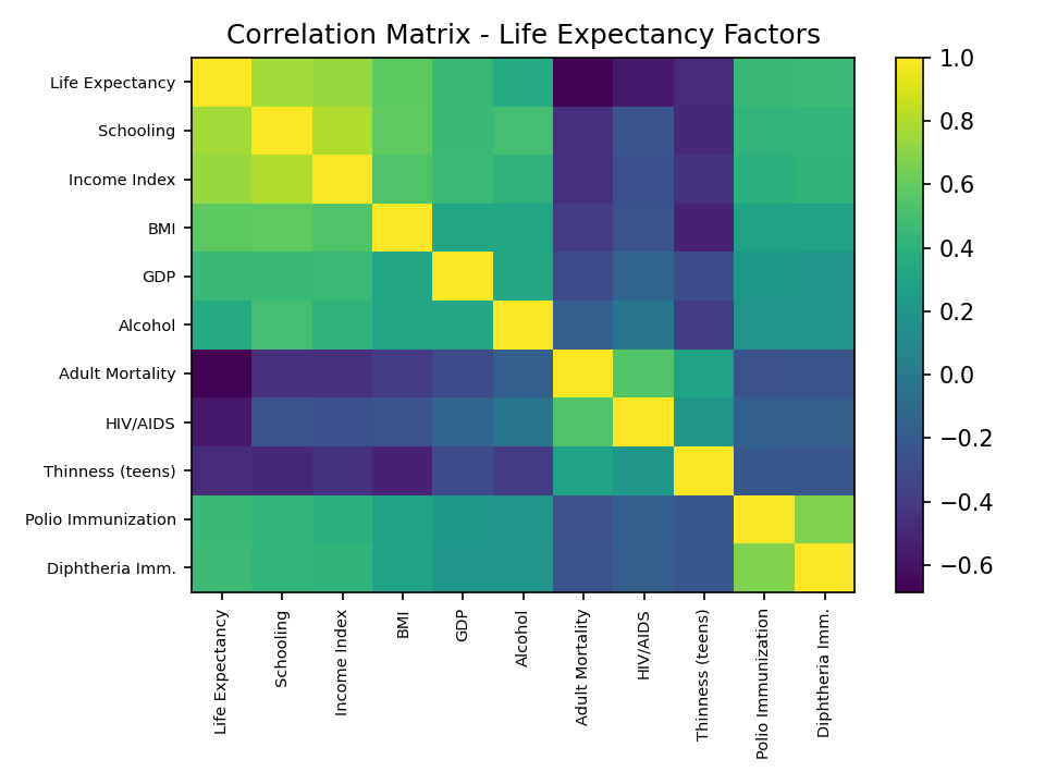
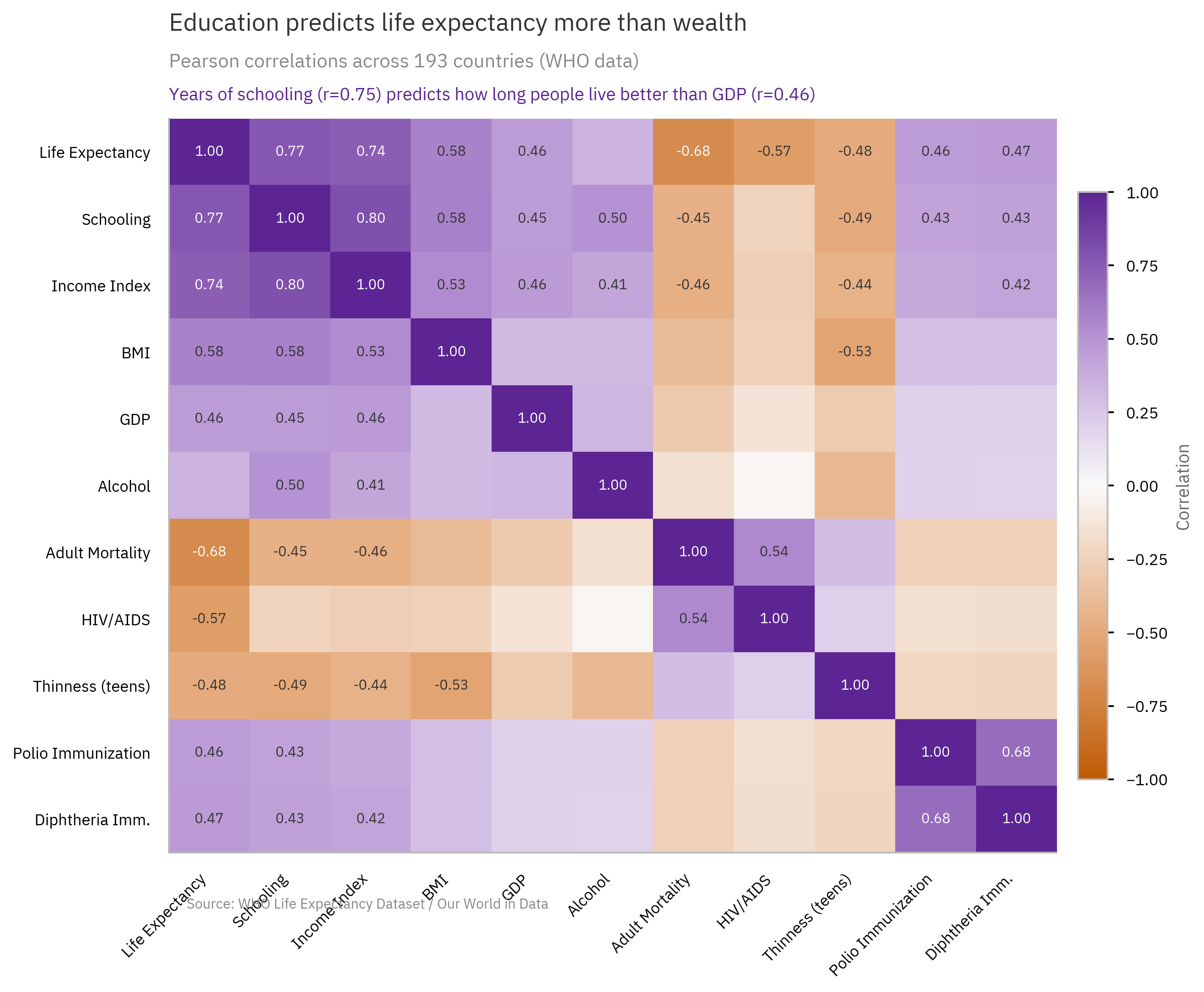
Three redesigns, before → after
Same data, same library — only the storytelling changes.
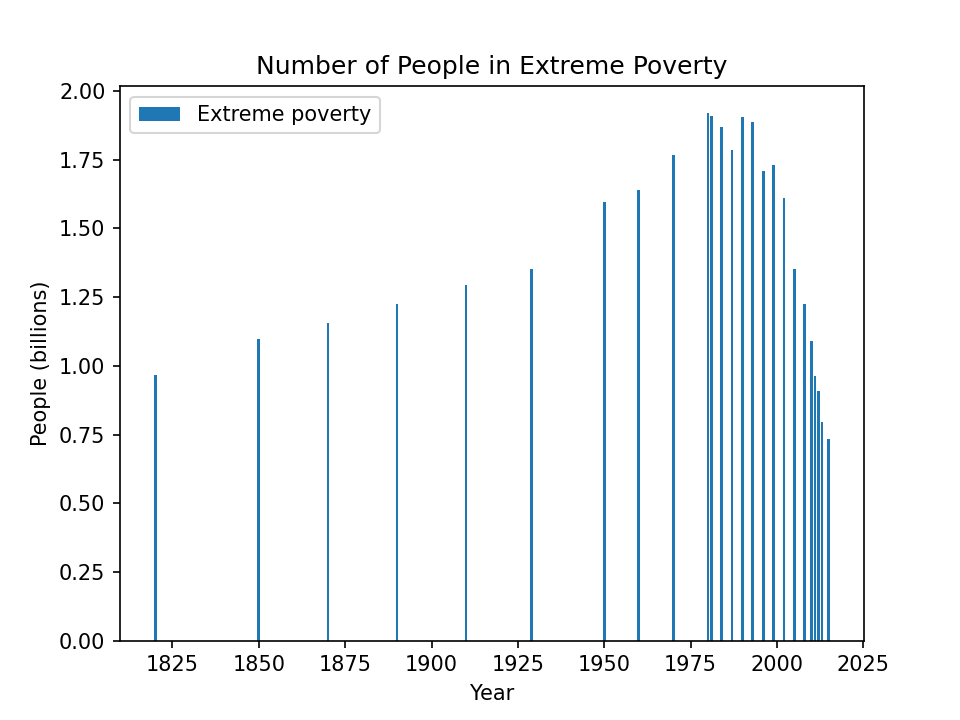 Default matplotlib
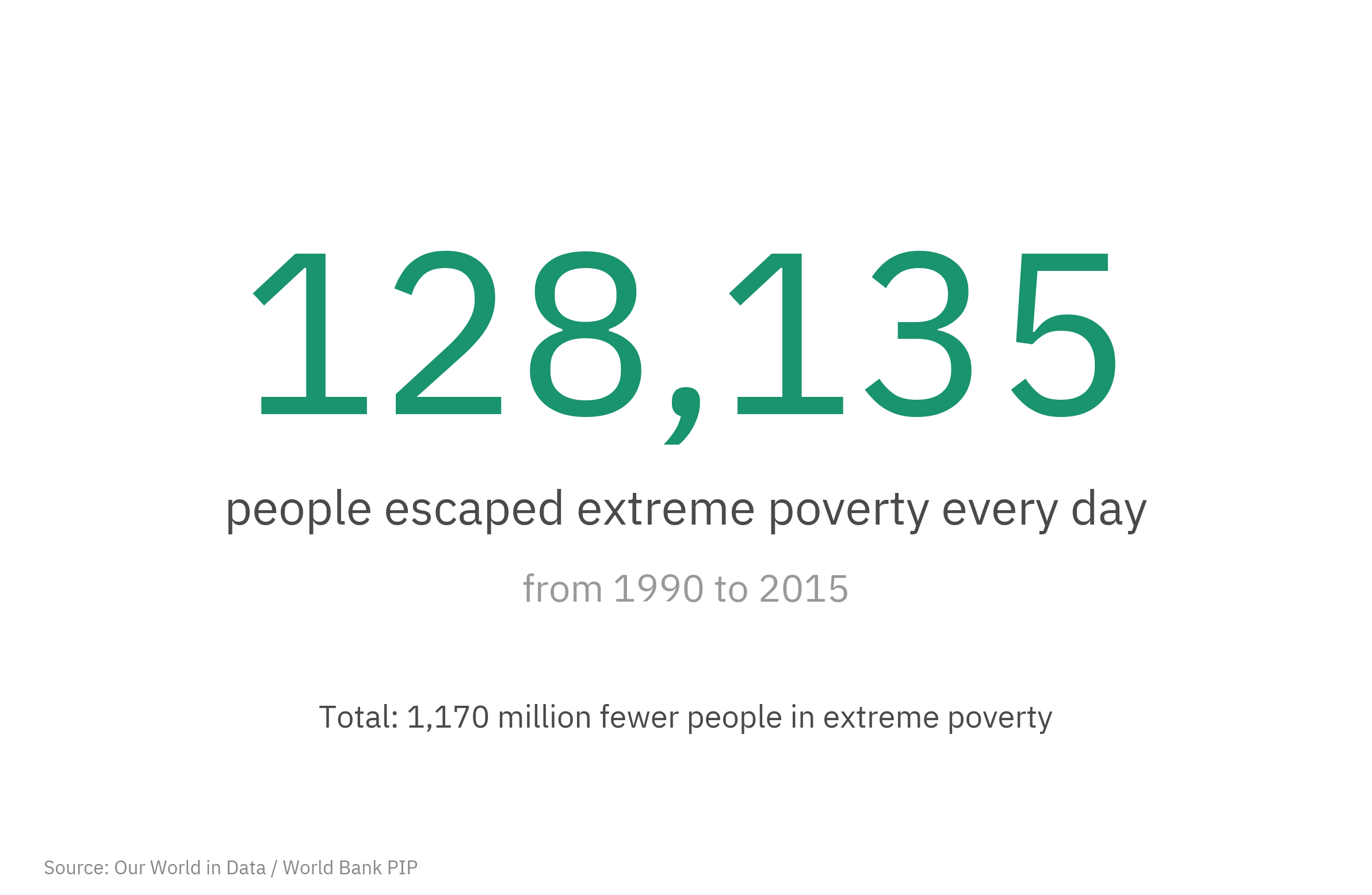 StoryGraph
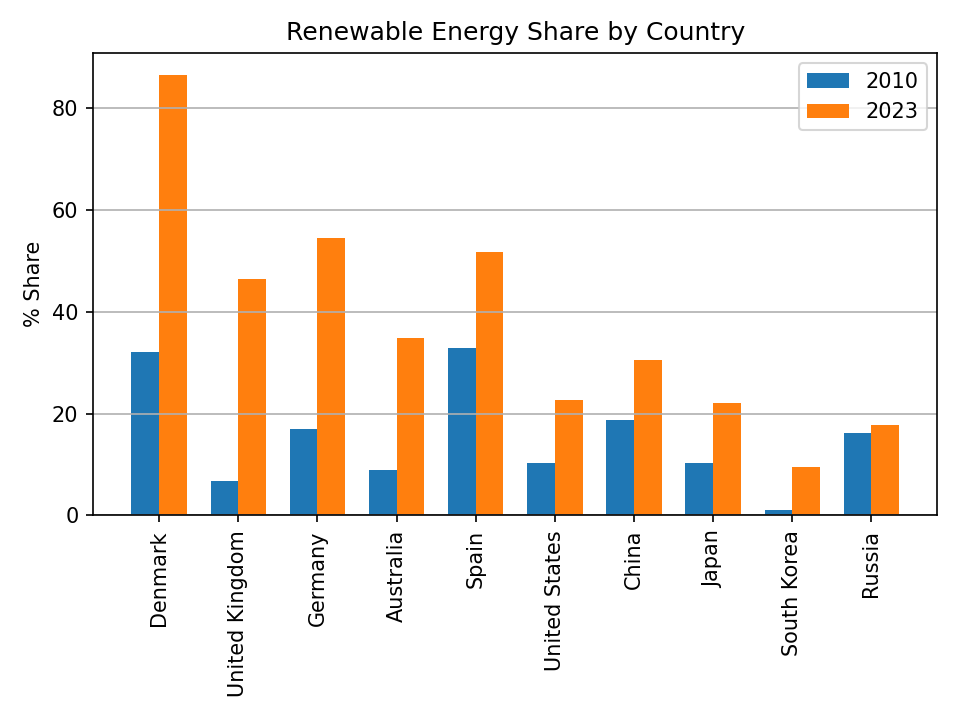 Default matplotlib
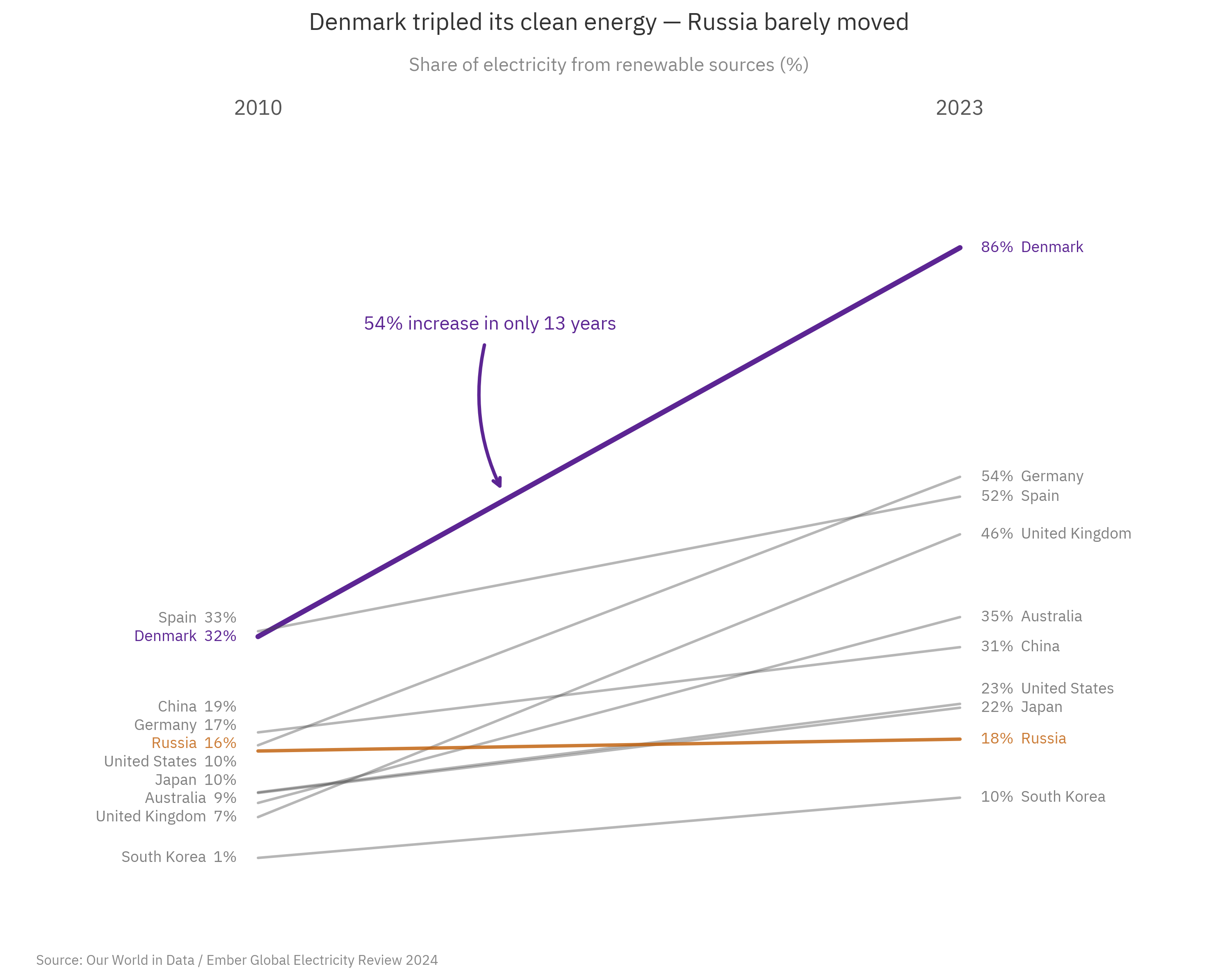 StoryGraph
 Default matplotlib
 StoryGraph